Project 4: Montage

KahlevonBose-P4Montage-Train

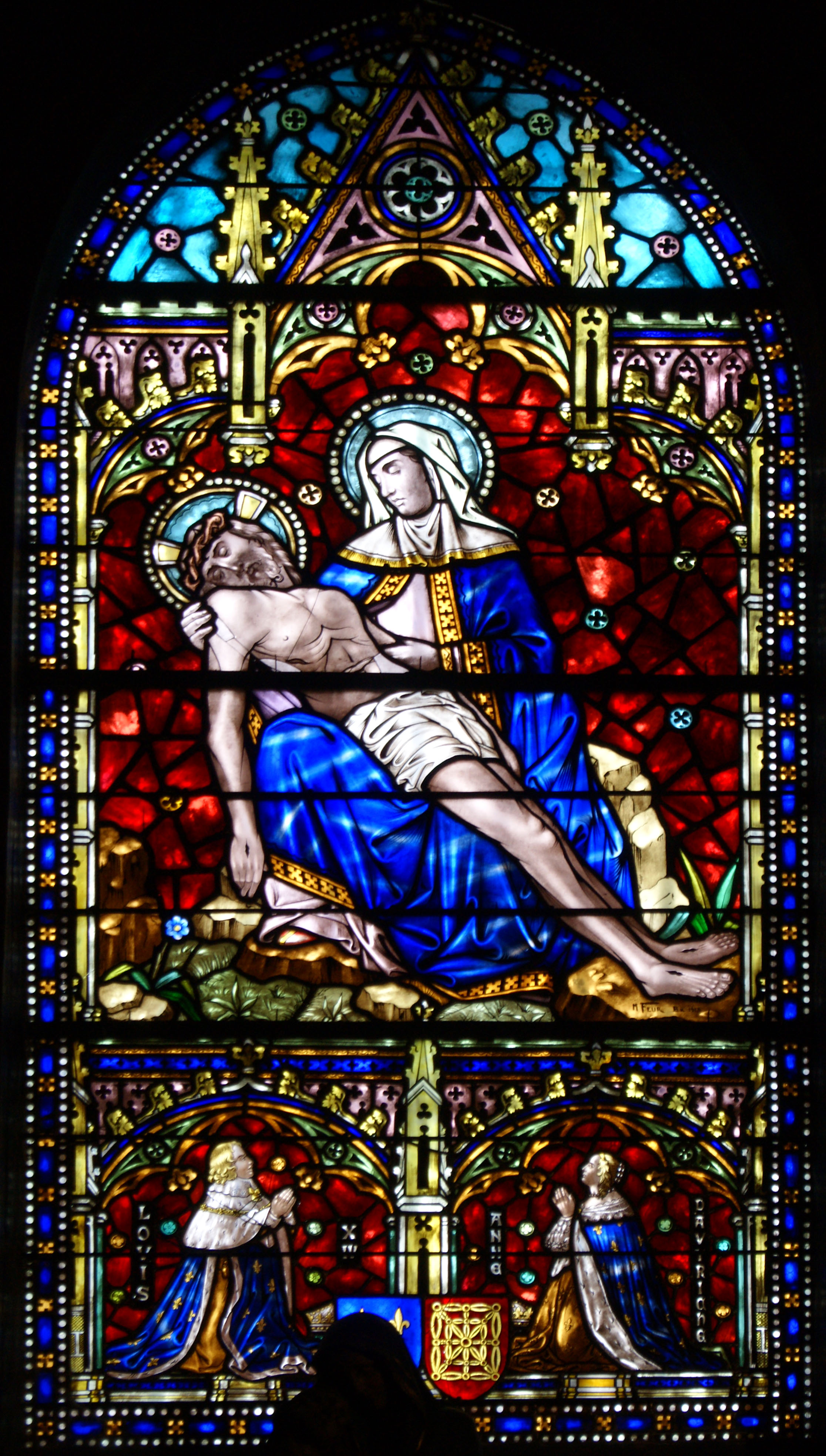
Description: Poster with a Spiritual message.

Process (Programs, Tools, Skills, Steps taken while designing): Using photoshop, I used overlay and mask techniques to bring the pictures together. I faded each of the pictures into each other with the stained glass window in the background. I spent a long time on alignment for the text, because of the white in the background photo. I was encouraged to use the outer glow effect on my text, which (especially in the print) made the words stick out from the background. Also, blending the organ into the background became a challenge when I realized the lines from the pipes distracted from my message. I let them come through in a couple of places, but especially on Christ’s body, I hid them to bring focus on Christ, and not on textures on his skin.

Message: Music is a powerful way to communicate faith.

Audience: Christian musicians and congregation members, in general.

Top Thing Learned: Conceptualizing and placing to seamlessly blend photos.

Filter / Colorization used and where it was applied: Several different filters were employed in different parts of this picture. I applied a sponge effect to the image of the Sainte-Trinité de Paris, behind Messiaen. Also, I applied a sharpening filter to the actual image of Young Messiaen, due to the lower quality of the original image. In colorization, I brought the saturation down in almost every image, especially for the background which was bright red. And in the picture of Young Messiaen, using the fade took out some of his color, so I change his hue to a bit more yellow, to make him seem less ghostly.

Color scheme and color names: Big Split Complementary – Teal, Gold, Brick, Violet

Title Font Name & Category: Nuptial Script Medium – Script

Copy Font Name & Category: Snell Roundhand Black – Decorative

Thumbnails of Images used:

tumblr_ld7y1kygyA1qzn0deo1_1280  Choir_Organ_of_Sainte-Trinité_Paris  Église_de_la_Sainte-Trinité_de_Paris_Face

SONY DSC

Sources (Links to images on original websites / with title of site):

Young Messiaen

Sainte-Trinité de Paris Choir Organ

Sainte-Trinité de Paris Face

Christ and Mary

Project 3: Photodesign

P3-KahlevonBose

Description: Encouraging PSA Poster about Talent and Music

Process: Using my simple Nikon point-and-shoot camera I got a photo of this chap playing the guitar. I used Photoshop to fine tune my photo, and create a working tetradic color scheme. Understanding audience helped me to create my message. I want people to be into music. True, not everyone is a musician. But if more people knew how to play an instrument, it would open so many doors for them. Not just externally, but internally: emotional health, mental health, physical health. Playing an instrument builds character and self-expression.

Message: If you want to live a better life, don’t close the door on your talents. Learn how to play an instrument, and it will make you happier.

Audience: Elementary-High School students.

Top Thing Learned: Photoshop is a really fun program. I learned how to use lots of it’s available tools: masking, text entry, text rotation and warping, color scheme implementation, selective color, brightness and contrast settings, vibrance, photo-healing, and sharpening.

Color scheme and color names: Tetradic color scheme. Yellow, Green, Purple, and Red.

Title Font Name & Category: ITC Officina Sans Bold Book – Sans 

Copy Font Name & Category: Minion Pro Bold Condensed – Modern

Thumbnail of original, unedited image inserted 

DSCN0382

Date and location you took the photo(s) 15 Oct 2015 in the Snow Building

P3 Activity: Photography

KahlevonBose-01-Outside-Light

Light 1: Outside

KahlevonBose-01-Inside-Light

Light 2: Inside

KahlevonBose-03-Close-Focus

Focus 1: Foreground

KahlevonBose-04-Background-Focus

Focus 2: Background

KahlevonBose-05-Composition

Composition 1: Thirds

KahlevonBose-06-Lead-Room

Composition 2: Lead Room

Through this project I found that I was able to take decent pictures with my camera (meaning it isn’t total junk because it is a point-and-shoot). I’ve always thought this, though. But after working on my pictures if photoshop (I realize I need some work in Photoshop… Yikes!) I saw they were quality enough that they have potential to look really nice. I live above where Sammy’s/Zeek’s used to be, so I took my pictures around that area, and in the campus Radio Station, inside one of the Production Rooms. I enjoyed jumping around and finding different angles, and photos that would work for me. Also, when I knew I was going to be using photoshop, I realized that my photo didn’t have to be perfect, but I could set it up, and figure out how I would need to crop it in order for it to look nice, but still contain the picture I wanted to end up with. For my first image I climbed out on top of the apple store and crouched down behind an A/C unit. I had to try several different angles before I was satisfied with how I used my thirds. The second image I just turned to Kendall and shot. It came out nicely, but I should have cleaned off the table, cause all the junk is really distracting. The third and fourth photos were funny. “Welcome”, immediately followed by an exit sign. I found that I had to focus on the wall behind first in order for the camera to blur the foreground, and also to set the light balance so things weren’t completely blown out. The Foreground Focus image I had to try for a minute, because the focus kept fading in and out, and the door kept disappearing. For the composition photo, I took a picture of the decorations my wife made on one shelf of our bookshelf in our living room. And then for the lead photo, I just had Sydney stand by the wall.

My favorite pictures are the image of the old Sammy’s Pie Shake, and the image of my wife Sydney. Even with the unedited images, I was proud of these two shots. I also discovered that I like lines. Almost all of my photos are full of lines. this wasn’t on purpose, but the distinct lines were in almost every picture. I’ll try to see where that will take my next photo. Hopefully somewhere good!

Project 2: Event Ad

P2KahlevonBose

  • Description: full bleed Event Ad Promoting Fund Raising for Local Charity
  • Process (Programs, Tools, Skills, FOCUS principles): Using Microsoft Word, a scanner, and an issue of Better Homes and Gardens Magazine (Oct 2014), I whipped out this ad this week. I tried to exemplify gestalt with the colors and lines, and to show a good example of arrangement with my boxes. It took a lot of concentration and focus to get the picture to render correctly, as things would disappear behind others at times, but I finally arranged everything, and got it ready. Also with color scheme, seeing as this event is about raising money for single-parent families, I chose a child-friendly color scheme, and made it a little flat. I based it on the yellow behind the childs right arm at first, and grew it from there.
  • Message: Donate to a charity supporting single-parent families in the community, and be eligible to register for cooking classes from great U.S. Chefs.
  • Audience: Middle-to-Upper Class Women, specifically Mothers.
  • Color scheme and color names: I used a triadic/primary color scheme. My colors don’t actually have names, but they have associated code, according to colorhexa.com. Blue is: #9cc2e5. Yellow is: #e1ed3f. Red is: #ff9966 (also known as Atomic tangerine)
  • Top Thing Learned: Get things done on time, because when the internet is down on campus, it makes it really hard to come up with a color scheme. Also, Word isn’t the first thing I would go to for designing, but I can use it now, and that’s good to know. Word 2016 is seriously lacking in the design capabilities, even when compared to Word 2013. Very frustrating, yes. But like I said, I could do it now.
  • Title Font Name & Category: Impact, Sans-Serif
  • Copy Font Name & Category: Modern No. 20, Modern
  • Scanned images used, sources, original sizes, location of scanner used: Image used: Barilla Pasta Advert in Better Homes and Gardens Oct 2014. Original size: 8.5″x11″ Scanner used was just inside of the door, in the Commons Technology room in the McKay Library. If we are being more specific though, you can find the scanner here: 43.819546, -111.783398 Also, because the companies I mentioned actually exist, I included their logos. The links to those images are as follows: Extended Family and Dinners Ready Logo

Project 1: Flier

Kahle-vonBose-InDesign-Flier

Description:

Black and white flier for promotion of Graduate Leadership Conference.

Process: 

After collecting my images, logo, and text, I sketched ideas of how I would create the space for the poster. I decided to go with an idea where I would flip the image, for a left to right direction. The text boxes being separate, made for good alignment with the atmospheric elements in the back, especially the line behind the man’s head, and black pole that is obscured by the text boxes. I used Adobe InDesign to place and structure the flier. I also made sure to focus on alignment, to create a flow from title, to text, to picture. There are several examples of the use of white space including the Title text, the space to the right of the text boxes, and the image itself.

Message: 

Seeking out soon-to-be graduates to provide them motivation to excel in their fields, and provide skills training that will prepare them to impress potential employers.

Audience:

Graduate and undergraduate who are close to starting a career.

Top Thing Learned:

That alignment is key. Having some sort of off-set is good to draw attention, but when everything is off-set, the message is lost.

Title Font Name & Category:

Arial Black, Sans Serif

Copy Font Name & Category:

Bodoni Twelve ITC, Modern

Links to images used in this project:

Graduate Image

Logo Image